Wednesday, December 11, 2013

5 Mini Projects

For this picture I used the website, fotoflexer.com. I liked this website because it was very easy to use and to find what you like. 

For this picture I used Befunky.com. I liked this website because it has very cool features, such as the effect I used on the image above. 

I used Photo505.com for this picture. I really liked this website because it allows you to put personal images onto cool backgrounds such as magizine covers, billboards, people's faces, and other stuff. 

This picture was made on Photofunia.com. This site overs cool features similar to Photo505 with putting your own pictures on things they dont belong on.

This was made this Picmonkey.com. This site is good for editing personal photos of people. Offers a lot of features for making your picture look better like the ability to get rid of blemishes and other things

Monday, November 25, 2013

Selfie

This is a piece I made using nine of the same pictures of myself. For each picture I used a different filter for each of the nine pictures. I think my piece looks good. Its funny how different only one filter can make your picture look a lot different.

Friday, November 22, 2013

Wordle

The words I chose for my words from a song that I really like call "Everybody's Something". I really like the line I used, because it talks about how everyone is important to someone and nobody is alone and nothing. I think this line is a good line to remember and is true.

Wednesday, November 20, 2013

NAPP Tutorial

Before

After
I read a tutorial about how to make images look like paintings. I used a picture of an artist I am a fan of and used what I learned from the tutorial to make him look like a painting. I like the piece that I made. It made the colors really cool and the lines of the picture not as sharp and made it look like a drawing or painting instead of him performing at a concert.

Wednesday, November 13, 2013

Chiles Trip


Before
After


Before

After

I really enjoyed out trip to Chiles Peach Orchard. I think that I got two really good pictures. The first picture I took was of a row of vines and the mountain behind it. For editing this picture, I enhanced the colors and the brightness to make the picture sharper. For my second picture I took a shot of the sign out front of the orchard. For editing this picture I made picture black and white. Then I brought the color back to the American flag and to the sign. I did this because it really makes those to objects stand out and look really cool. I also played with the contrast and brightness of them to make them sharper. 

Marla Project

For this project we had to mimic the art work done by four year old artist, Marla. Marla's paintings were abstract and became very famous. For my project I went with an abstract painting with many different colors. The background of my painting is a dark blue I thought would look good and compliment the other colors I used and really make them pop. The after putting the dark blue background, I add many different color lines on top of the background. I really like this work of mine because I think the colors really pop at the viewer and all the craziness in the end looks really good together.

Wednesday, October 23, 2013

Kaleidoscope


Our assignment was to make three kaleidoscopes out of pictures we took around the school. The three pictures I took were a picture of my friend Michael DeSimone, a picture of the senior mural of outer space and a picture of the mat on the floor by the gym. I enjoyed doing this project. I like my piece of Michael and of the senior mural.

Monday, October 21, 2013

Visual puns


For this project, our assignment was to make visual puns out of different images. The puns I chose to visually create were sun flower, star fish, butterfly, and fruit punch. For my sun flower I put an image of a sun over a real sun flower to make the flower part of the plant looked like a sun. In the sun flower piece I used the effects gradient and overlay to make the piece look how I liked. For my fruit punch pun I used an apple as my fruit and gave it arms with boxing gloves to be a punching fruit. I posterized the background to go with the cartoon theme of my piece. For butterfly I gave a stick of butter wings so it could fly. I used threshold and posterize on that piece. Lastly I did Star fish which was patrick star from spongebob on a red carpet making the actual star fish a superstar. I used threshold and posterize.

Wednesday, October 16, 2013

For this piece we had to take a image and add a background it to make it look like one image. For this project I chose a image of my favorite band Dave Matthews Band and placed them in front of WAHS. My inspiration for this is I was listening to the band and chose them to put on the background of school. The sax player for the band graduated from Western and my dad went to school with him. I thought it'd be cool to bring him back here.

Friday, October 4, 2013

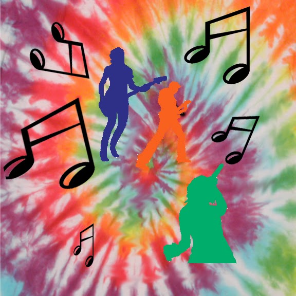
Music Piece

Our assignment was to use a view images and a background to make a piece. As our first project, the main purpose was for us to explore with the photoshop program that we will use in class and learn the basic tools we need to know to create pieces. I enjoyed doing this project and I learned a lot from this assignment. I learned how to cut images into separate pieces and how to change their size. Also I learned how to move images and color them differently.

Crazy Combos


For this project our assignment was to combine multiple different images and put them into one. I had trouble deciding what I wanted to do for this project when first assigned. When I work on artistic projects I like to listen to music. I realized that I could incorporate the music I was listening to into my project. I decided I would use features of the artist's bodies to make one person. I used singer, Frank Ocean's body to start my project. Then I decided I'd use artist, Tyler the Creators' nose to put on his face. After that I used rapper, Earl Sweatshirt's, lips to add to the face. Then after that their friend Lucas' eyes. Once I was done I decided to add a personal touch to my piece but putting a hat on him and add the western logo to his hat. I'm happy with my piece.

Wednesday, October 2, 2013

15 Green Things

Our assignment for this project was to incorporate 15 different green, preselected items into one picture.  With this project we were given a lot of freedom to decide how we would use and arrange the photos. With this project the there were endless possibilites of how the 15 would be put into the work. With my project I used the large archway as my background; I thought it would serve as a good setting for my piece. I used the car as the center piece of my work. The car is the main focus of my work and all the other objects are arranged around it. I went with a somewhat abstract piece but it still has mostly non abstract features. I liked what the black and white feature did to my work.